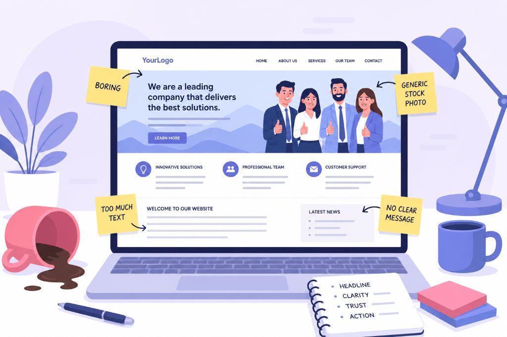
Most business owners/marketing execs come to us because they think they need a new website. Usually, they’re right. But not always for the reason they think.
They’ll say things like, “It looks a bit dated,” or “We want something more modern,” or “We need it to look more professional,” or the age old favourite, “It just needs to me more… wow!”
And yes, most of the time the design is the main problem. Sometimes the website genuinely looks old, clunky, cheap or forgotten about. But more often, the real issue is deeper than that.
Much of the time, the website is unclear. It’s slow. It talks too much. It hides the important stuff. It looks like every other business in the industry. It makes the visitor work too hard.
And worst of all, it has been built around what the business wants to say, rather than what the customer needs to hear.
That is where websites start costing money.
Not because they are broken in an obvious way. Not because the contact form or custom integration does not work. Not because there is some huge technical disaster happening behind the scenes. But because people land on the site, feel unsure, get bored, lose trust, or cannot quickly see why they should choose you.
So they leave.
And you probably never know it happened.
Nobody is Reading Your Longwinded Jibber Jabber
One of the biggest mistakes businesses make with their website is assuming people are going to read it properly.
They are not.
People do not read websites the way businesses write them. You might spend weeks agonising over every paragraph, every sentence and every bit of copy on the homepage, but your visitor is not treating it like a book. They are skimming and scanning. They are jumping around. They are looking for clues.
They want to know whether they are in the right place. They want to know whether you can solve their problem. They want to know whether you look credible. They want to know what to do next.
If they cannot work that out quickly, they are gone.
This is why most websites use too many words. They say too much and communicate too little. Businesses fill pages with background information, internal language, vague positioning and sentences that do not actually help the visitor make a decision.
The visitor does not need every detail upfront. They need the right detail at the right time.
Good website copy is not about filling space or proving how much you know. It is about creating momentum. Each section should answer a question, remove a doubt, build trust or guide the visitor towards action.
If it does none of those things, it probably should not be there.
A useful test is to look at every sentence and ask, “Would the page be weaker without this?”
If the answer is no, cut it.
This does not mean dumbing things down. It means respecting the fact that your visitor is busy, distracted and probably comparing you with three other companies.
Your website should make the important things obvious. The headline should do some heavy lifting. The page should be easy to scan. The sections should have a clear purpose. The calls to action should be visible. The wording should be direct.
If people have to work hard to understand you, the website has already failed.
People Will Judge You, Quickly
This is uncomfortable, but true. People make snap judgements based on how your website looks and feels.
Before they have read your testimonials. Before they have looked at your case studies. Before they have spoken to you. Before they have understood your process.
They have already formed an opinion.
If your website feels polished, current and professional, they assume the business is probably polished, current and professional.
If it feels cheap, dated, messy or generic, they assume the same about the business.
That might not be fair, but it is how people behave.
This is why design matters. Not because your website needs to be flashy, clever or packed with visual tricks, but because visual quality creates trust. A good first impression gives everything else on the page a better chance of working.
A bad first impression does the opposite.
If the site looks poor, people read your copy with more scepticism. They question your claims. They doubt your reviews. They become more cautious. They start looking for reasons not to enquire.
And the worst part is they probably cannot explain that this is what happened. They just “didn’t feel it”.
That feeling matters.
Your Shit Stock Photos Are Not Helping
Of course, some premium stock photography can work well when it’s chosen carefully. But we both know the kind of imagery I’m talking about: the forced smiles around a laptop, the spotless meeting room, the copy and paste suits shaking hands, the group of unnaturally happy professionals pointing at a screen like they’ve just discovered fire.
Everyone knows they are stock photos.
They might make the page look more complete, but they rarely make the business feel more trustworthy. In fact, they often do the opposite.
The moment a visitor sees imagery that feels fake, a bit of trust disappears. They might not consciously think, “That photo is damaging my perception of this business,” but they feel it.
Real photos are almost always better.
Real people. Real workspace. Real projects. Real products. Real details. Even if the images are not perfect, they carry something stock photography does not: credibility.
This is becoming even more important now that the internet is filling up with AI-generated images, polished templates and websites that all have the same clean, soulless feel.
The businesses that feel real will stand out.
That does not mean every photo on your website needs to be an expensive brand shoot. But it does mean you should stop pretending the generic boardroom image represents your company.
It does not.
A Fancy Pants Website Can Still Be Useless
I have seen plenty of good-looking websites that do almost nothing commercially.
They have nice spacing, nice colours, nice typography, nice animation and absolutely no clear message.
That is not good design. That is decoration.
A website has a job to do. It needs to explain what you do, who you help, why someone should care and what they should do next.
If it does not do that, it does not matter how attractive it is.
This is where businesses can get distracted. They focus too much on how the website looks and not enough on whether it works.
The best websites are not just pretty. They are clear.
Clarity is what gets someone from “I’m not sure” to “This looks right for me.”
If your visitor cannot understand your offer within a few seconds, you have a problem. If they cannot tell what makes you different, you have a problem. If they do not know where to click next, you have a problem.
Design should support the message.
When it gets in the way, the design is the problem.
Stop Hiding Pricing, It’s Wasting Everyones Time
A lot of businesses are nervous about putting prices on their website. I understand why. Sometimes pricing is complex. Sometimes every project is different. Sometimes you do not want competitors looking at your numbers. Sometimes you worry a price will scare people away.
But here is the reality: whether you show pricing or not, your website is filtering people.
If you show some level of pricing, even just “starting from” figures or typical project ranges, you help the right people qualify themselves.
If you hide pricing completely, you may get more enquiries, but many of them will be from people who were never going to be a good fit.
That means more calls, more proposals, more chasing and more awkward conversations about budget.
Your website should not be trying to generate as many enquiries as possible. It should be trying to generate the right enquiries.
There is a big difference.
Being clear about pricing is not just about money. It is about positioning. It tells people where you sit in the market. It helps them understand whether you are the right option for them.
If someone is put off because your pricing is higher than they expected, that is not always a bad thing. It may have saved both sides a wasted conversation.
Stop With The Page Bloat Already
More pages can feel like more value. In reality, more pages often create more confusion.
Every extra page is another place for someone to get lost. Another decision. Another bit of content to maintain. Another opportunity to dilute the message.
Most business websites need fewer, better pages.
A strong homepage. Clear service pages. Useful proof. A good About page. A simple contact route. Maybe some genuinely helpful articles or resources.
That is usually far more effective than a bloated website full of thin, overlapping pages that nobody reads.
The structure should guide people naturally. They should not have to wonder where to go next. They should not have to click through five pages to understand whether you can help them.
A good website feels obvious. Not basic. Not boring. Obvious. There is a difference.
Stop Being So Precious, It’s Not About You
This is where website projects can get difficult.
As a business owner, you are emotionally attached to things your customers simply do not care about.
You care about the exact shade of blue. You care about the internal name for a service. You care about the founder story and history. You care about the order you personally prefer things in. You care about the way you have always explained what you do.
Some of that might matter.
Most of it does not.
Your customer is not coming to the website to admire your brand guidelines or learn how your business was established back in 1984. They are coming with a problem, a need, a goal or a frustration.
They want to know whether you can help.
That is why a good web project needs a bit of objectivity. Sometimes the right decision is not the one you personally like most. It is the one that makes the page clearer, faster, easier to use or more persuasive for the customer.
You are not building the website for yourself. You are building it for the person deciding whether to trust you.
You’re Not Done When It’s Done
A lot of businesses treat a website launch like the finish line.
It is not. It is the start.
Once the site is live, you can finally see how real people use it. Where they come from. What they click. Where they drop off. What pages they visit before enquiring. What content helps. What gets ignored.
That information is valuable.
A website should improve over time. The first version should be strong, but it will never be perfect. The businesses that get the best results are usually the ones that keep refining.
They improve calls to action. They add better proof. They rewrite unclear sections. They test different landing pages. They improve speed. They keep content fresh. They pay attention to what is actually happening.
If someone builds your website, hands it over and disappears, that might be enough for a basic project.
But it is not how you get the best long-term result.
Your website is not a brochure that happens to be online. It is a living business asset.
We Know You Don’t Really Want a Website
This is the bit that matters most.
You probably do not wake up thinking, “I would love to spend money on a new website.”
You want what the website is supposed to give you.
More enquiries. Better leads. More sales. More trust. More authority. Better positioning. A stronger first impression. A business that looks as good online as it is in reality.
That is the point.
The website is not the outcome. It is the tool.
So when we build a website, we are not just thinking about pages, colours and layouts. We are thinking about what the site needs to do for your business.
Who needs to visit it? What do they need to understand? What doubts do they have? What proof do they need? What action should they take? What would stop them?
That is where good web design actually happens.
Not in making something pretty for the sake of it. Not in adding tricks. Not in copying what everyone else is doing.
Good web design is about making the right things clear to the right people, quickly.
So, Is Your Current Website Actually Helping?
That is the question worth asking.
Not “Do I like it?”
Not “Does it look modern?”
Not “Is it better than the old one?”
The real question is whether your website is helping the business grow.
Is it building trust? Is it explaining your offer clearly? Is it attracting the right people? Is it easy to use? Is it fast? Is it giving people enough confidence to enquire?
If not, it is probably costing you money.
And you may not see that cost directly, because it shows up as the enquiries you did not get, the visitors who left, the leads who chose someone else and the people who decided, in a few seconds, that you were not for them.
That is the harsh truth.
Your website does not need to be the loudest, cleverest or most complicated site in your industry.
It needs to be clear. Credible. Fast. Human. Useful. Built around your customer, not you. And honest about why someone should choose you.
That is what works.
And if your current website is not doing that, it is probably time to stop patching it up and start asking better questions.