Most business owners file accessibility under “things that apply to other people”. Councils, the NHS, big corporates with compliance departments. Not a twelve-person business in Gloucestershire with a tidy-looking website.
The numbers say otherwise. So, increasingly, does the law.
The numbers are worse than you would guess
WebAIM tests the top one million home pages every year. In its 2026 report, 95.9% of them had detectable failures against the WCAG standard. That is up from 94.8% the year before, which reversed six straight years of small improvements. Accessibility is not slowly getting better. It just got worse.
The average page carried 56 detected errors. Not one or two awkward edge cases. Fifty-six.
Here is the part that should sting, though. Around 96% of every error found falls into just six categories, and they have been the same six categories for seven years running. This is not an exotic technical problem that nobody has cracked. It is the same short list of basics, going unfixed, year after year.
The same six failures, every single year
- Low contrast text, now on 83.9% of home pages, up from 79.1%
- Missing alt text on images, affecting more than half of all pages
- Form inputs with no label, on 51% of pages
- Links with no text a screen reader can announce
- Buttons with no accessible name
- No document language set on the page
Look at that list as a business owner rather than a developer. Low contrast is a design choice somebody made. Alt text is typing. Labelling a form field is a five-second job at build time. Setting the page language is one line, written once, and then never again.
None of this is hard. That is rather the point.
Who it actually shuts out
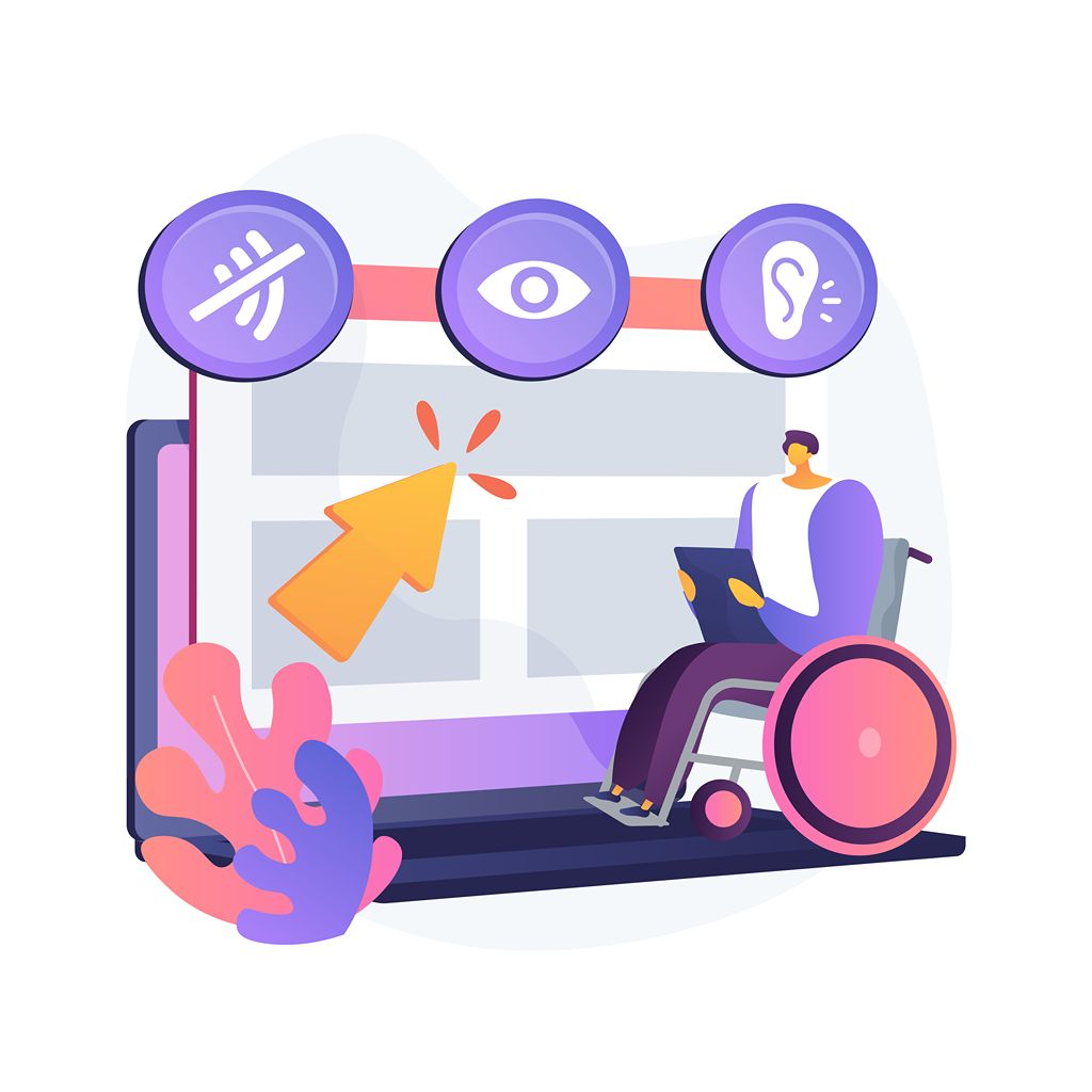
The mental image most people have is a blind user with a screen reader, and that user certainly matters. But the group affected by these six failures is far wider than that.
Low contrast text is a problem for anyone with reduced vision, which eventually includes most of us, and for anyone reading a phone screen outdoors. Unlabelled form fields break things for screen reader users and confuse everyone else. Buttons and links with no accessible name are a wall for anyone navigating by keyboard rather than mouse, including people with motor difficulties and plenty of people who simply prefer it.
Accessibility failures rarely stop at the group they are named after. They quietly make the site worse for a much larger slice of your visitors, most of whom would never describe themselves as having an access need.
The legal position has moved
In the UK, the Equality Act 2010 has always applied to private businesses providing services, not just the public sector. That is not new, though plenty of businesses still assume it only covers ramps and parking spaces.
What is new is the European Accessibility Act, which became applicable across the EU on 28 June 2025. It sets accessibility requirements for a range of consumer products and services, and it reaches beyond the EU’s borders: it can catch UK businesses that sell products or services to consumers in the EU. Very small businesses are treated differently, and there are transition arrangements for some services that already existed before the deadline.
Whether it applies to you depends on your size and on whether you sell into the EU, so this is worth checking properly rather than assuming either way. We are not lawyers and this is not legal advice. But “we did not realise it applied to us” has never been a strong position to be in.
Why it never gets fixed
Mostly because the person who paid for the website never experiences the problem.
You can see your own site perfectly well. You know where the buttons are. You already know what the business does, so vague link text reads fine to you. And nobody emails to say “I could not complete your contact form”. They just go somewhere else, which is the same quiet, invisible loss that most website problems cause. No complaint, no data, no clue.
The other reason is that accessibility rarely appears on anyone’s list at build time, and retrofitting it later is considerably more painful than getting it right while the thing is being made.
Be wary, too, of plugins and overlays that promise instant compliance for a monthly fee. A widget bolted onto a site does not fix contrast decisions, missing labels or badly structured content underneath it. It mostly buys a reassuring icon in the corner of the screen.
Where to actually start
Start with the six. They account for the overwhelming majority of detected errors, so fixing them moves the needle further than any amount of strategising.
Check your colour contrast properly rather than by eye. Write real alt text that describes the image, not “image1”. Make sure every form field has a label attached to it. Give every link and button text that makes sense when read on its own, so “read more” becomes something useful. Set the page language.
Then do the test that costs nothing: put the mouse down and try to get through your own site using only the keyboard. Tab through the navigation, open the menu, reach the contact form, fill it in and submit it. If you cannot complete your own enquiry journey that way, a portion of your visitors cannot either.
What makes all of this uncomfortable is not the difficulty. It is that the same six problems have topped the list for seven years, on nearly every website tested, while the tools to fix them sat there the whole time. That is not a technology problem. It is an attention problem, and attention is something any business can choose to give.